The Beginner's Guide to Ink Swatching and Shading Inks


If you entered the fountain pen hobby thinking you would stick to a single bottle of standard blue or black ink, we have some news for you: The ink rabbit hole is deep, colorful, and utterly mesmerizing.
Before you know it, a single bottle turns into five, then ten, then a drawer full of sample vials. You quickly realize that fountain pen ink isn’t just liquid color—it’s a dynamic medium capable of incredible optical tricks like shading, sheening, and shimmer.
To keep track of a growing collection and see how an ink actually behaves on paper before loading it into a prized writing instrument, fountain pen enthusiasts rely on a creative ritual known as ink swatching.
If you're ready to start documenting your collection, here is a beginner’s guide to ink swatching and decoding the magic of premium inks.
What is Ink Swatching? (And Why You Need a Library)
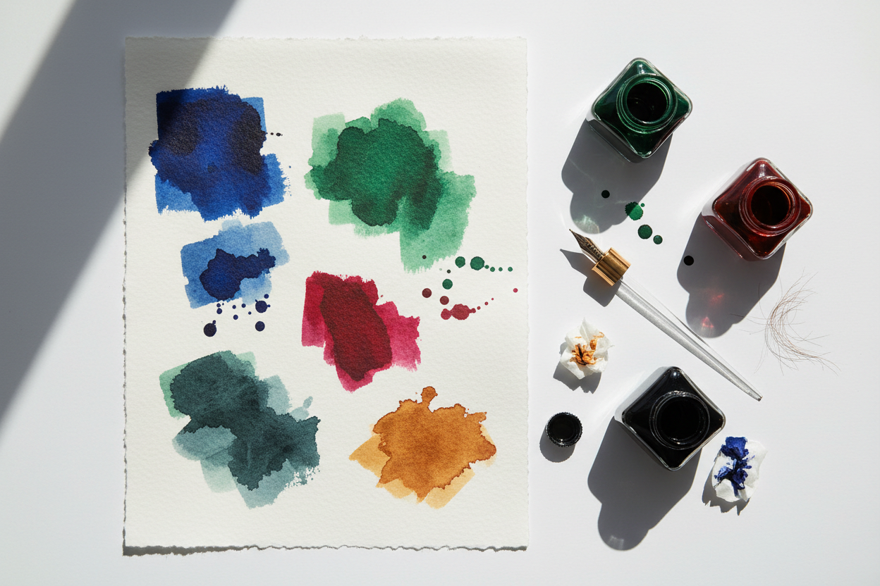
Ink swatching is the practice of creating a small, standardized visual reference card for every ink color you own.
You might wonder: Why not just write the name of the ink in a notebook?
Because fountain pen ink is water-based, its appearance changes drastically depending on how heavily it is applied to the page. A quick line from a fine nib looks completely different than a heavy pool of ink. A proper swatch captures the full spectrum of a single color—showing you how it looks in thin, delicate lines as well as thick, saturated washes.
By creating a uniform set of swatch cards (using dedicated systems like Col-o-ring cards or heavy watercolor paper), you can easily compare your inks side-by-side to find the perfect shade for your next journal entry or letter.
How to Swatch Fountain Pen Ink: A Step-by-Step Method
You don't need to ink up a pen just to create a swatch. In fact, it's much faster to do it using a few basic art tools:
-
Prepare the Paper: Always use heavy, ink-friendly paper (at least 200gsm to 300gsm if using watercolor stock) so the liquid doesn’t warp or bleed through the card.
-
The Cotton Swab Dip: Dip a clean cotton swab into your ink bottle. Draw a thick, sweeping band across the top of your swatch card. Pass over the first half a second time to create a heavy layer of saturation. This reveals the ink's maximum pooling behavior.
-
The Dip Pen Line: Take a glass dip pen or a clean metal calligraphy nib, dip it into the bottle, and write the brand and color name directly below the ink wash. This shows you exactly how the ink will look during normal, everyday writing.
-
Let It Dry Naturally: Never use a hair dryer or heat gun to speed up the process. The true magic of fountain pen ink happens during a slow evaporation process on the page.
Decoding the Magic: Shading vs. Sheening vs. Shimmer
As you build your swatch library, you will notice that premium boutique inks do things that standard ballpoints could only dream of. Here are the three main properties you will uncover:
1. Shading Inks (The Gradient Effect)
Shading occurs when ink pools unevenly inside the letters you write. When you lift your pen at the end of a stroke, a tiny extra pool of liquid is left behind. As it dries, the areas with less ink dry light, while the pooled areas dry dark. This creates a gorgeous, two-tone gradient effect within a single word, giving your handwriting an unmistakable, hand-crafted character.
2. Sheening Inks (The Metallic Flash)
Sheen is a dazzling optical illusion. Some highly saturated inks are packed with so much dye that when a heavy pool dries on the page, the crystals sit on top of the paper instead of absorbing into it. When the light hits these crystals at an angle, they reflect a completely different metallic color. For example, a deep blue ink might dry with a brilliant, fiery red or copper sheen.
3. Shimmer Inks (The Glitter Factor)
Unlike sheen, which is a chemical reflection, shimmer is purely physical. Shimmer inks are infused with microscopic particles of metallic glitter or mica dust. When you write, these tiny particles settle onto the paper, making your words sparkle brilliantly under the light.
Frequently Asked Questions (People Also Ask)
Why does my ink look flat and dull compared to swatches online?
The secret to unlocking shading and sheen is the paper. Standard, absorbent copy paper acts like a sponge, drinking up the ink instantly and flattening the color. To see dramatic shading or metallic sheen, you must use fountain pen friendly paper (like Tomoe River, Clairefontaine, or Midori), which features a special surface coating that lets the ink sit on top of the page as it dries.
Can shimmer inks clog my custom fountain pen?
Yes, if left unmonitored. Because shimmer inks contain actual solid glitter particles, they can get trapped inside the narrow channels of a pen's plastic feed if the pen sits unused for a long period. If you love shimmer inks, make sure to flush your pen thoroughly every two to three weeks to keep the pathways clear.
What is a "dry" ink vs. a "wet" ink?
This refers to the ink's flow characteristics. "Wet" inks contain more lubricants, causing them to flow incredibly fast and smooth out of the nib (great for dry or fine pens). "Dry" inks have more surface tension, offering a tighter, more controlled line width (perfect for wet or broad pens).
Bring Out the Best in Your Inks with Springfield Pens
Every premium ink deserves a stage to show off its true performance. At Springfield Pens in New Westminster, we design our bespoke wood and resin fountain pens to maximize the visual beauty of your ink collection.
By pairing our hand-tuned, free-flowing feeds with broader nib choices or flexible options, our custom writing instruments deliver the perfect, consistent flow of liquid required to unlock deep shading and breathtaking metallic sheen on your favorite paper. Discover a tool engineered to turn your ink swatches into daily masterpieces.
Share:
Converter vs. Cartridge: Which Fountain Pen Ink System is Better?
How to Choose Fountain Pen Friendly Paper (Goodbye, Bleed-Through)